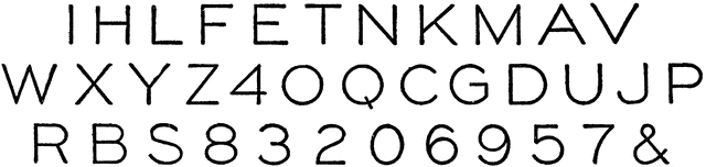
Upright Single Stroke Capitals
| View Cart ⇗ | Info

“The upright single-stroke “commercial gothic” letter is a standard for titles, reference letters, etc. In the proportion of width to height the general rule is that the smaller the letters the more extended their width should be. A low extended letter is more legible than a high compressed one and at the same time makes a better appearance.” —French, 1911
Galleries
Complete AlphabetsSource
French, Thomas E A Manual of Engineering Drawing for Students and Draftsmen (New York, NY: McGraw-Hill, 1911)
Downloads
2400×573, 128.7 KiB
1024×244, 23.6 KiB
640×152, 14.2 KiB
320×76, 5.9 KiB