Letter Y
This is a uppercase letter Y shown enclosed in a box with a background of a seashell and seaweeds.
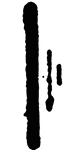
Letter I
This letter I is shown in uppercase, enclosed in a box with a background of a skeletal image running…
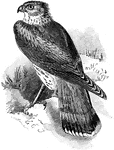
Merlin
"The letter C marks the point where the vessel to be exhausted is attached." -Century, 1889The Merlin…
Letter Y
This is a uppercase letter Y shown enclosed in a box with a background of a seashell and seaweeds.
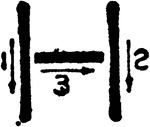
Letter I
This letter I is shown in uppercase, enclosed in a box with a background of a skeletal image running…
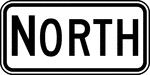
North, Black and White
"Cardinal Direction auxiliary signs carrying the legend NORTH, EAST, SOUTH, or WEST should be used to…
East, Black and White
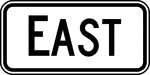
"Cardinal Direction auxiliary signs carrying the legend NORTH, EAST, SOUTH, or WEST should be used to…
South, Black and White
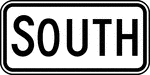
"Cardinal Direction auxiliary signs carrying the legend NORTH, EAST, SOUTH, or WEST should be used to…

West, Black and White
"Cardinal Direction auxiliary signs carrying the legend NORTH, EAST, SOUTH, or WEST should be used to…
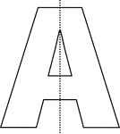
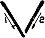
Vertical Line of Symmetry, Letter A With
Letter A with a dotted vertical line that is a line of symmetry.
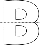
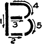
Horizontal Line of Symmetry, Letter B With
Letter B with a dotted horizontal line that is a line of symmetry.
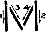
Upright Single Stroke Capitals
"The upright single-stroke "commercial gothic" letter is a standard for titles, reference letters, etc.…

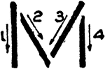
Commercial Gothic Letter M Second
An alternate illustration of letter M using Commercial Gothic stroke order.
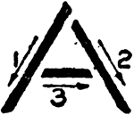
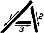
Commercial Gothic Letter A
A diagram illustrating stroke technique for letter A in Commercial Gothic.
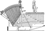
Type Writing Machine
There were minor variations from one manufacturer to another, but most typewriters followed the concept…
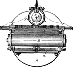
Linotype Machine
A Linotype machine is a line casting machine used in printing. The machine revolutionized printing and…
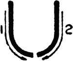
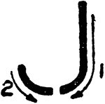
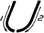
Commercial Gothic Letter U
An illustration showing how to write Commercial Gothic Letter U using correct strokes.
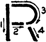
Commercial Gothic Letter R
An illustration of writing Commercial Gothic Letter R using correct strokes.
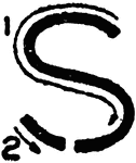
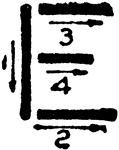
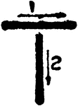
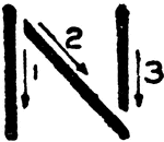
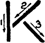
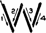
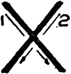
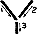
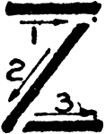
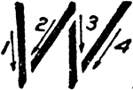
Inclined Capital Letters
"The single stroke inclined letter made to a slope of between 60 and 70 degrees is preferred by perhaps…
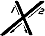
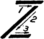
Inclined Capital Letter X
The illustration shows the proper strokes in writing Inclined Capital letter X.
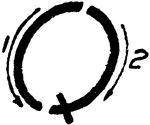
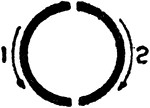
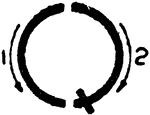
Inclined Capital Letter Q
The illustration of writing the Inclined Capital letter Q using proper strokes.
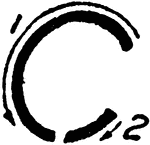
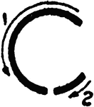
Inclined Capital Letter C
The illustration of writing the Inclined Capital letter C using proper strokes.
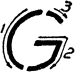
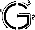
Inclined Capital Letter G
The diagram shows the stroke directions in writing letter G using Inclined Capital.
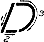
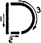
Inclined Capital Letter D
The diagram demonstrates proper strokes for writing Inclined Capital letter D.
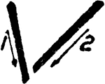
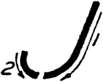
Inclined Capital Letter U
A demonstration of writing Inclined Capital letter U using proper stroke technique.
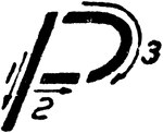
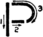
Inclined Capital Letter P
The diagram showing stroke directions for writing an Inclined Capital letter P.