This tutorial will cover the implications of color blindness for web accessibility. Color contrast guidelines for making content more perceivable will also be addressed.
- Color and Web Accessibility Video Tutorial (CC)
- Video Tutorial: Larger Version (.mov, CC)
- Directions (HTML)
- Print Directions (Tagged PDF)
There are two issues related to color that need to be addressed when designing for the Web:
- a small number of visitors to your website may not be able to see all the colors used in your designs.
- insufficient contrast between your background and foreground colors could make it harder to read the text in your web pages.
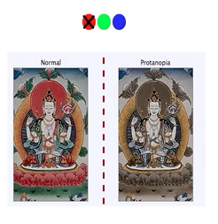
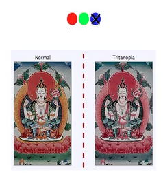
Color blindness, the inability to perceive certain colors, is a condition that affects about 1 in 12 men and 1 in 200 women. Common types of color blindness include:
- Protanopia and protanomaly: people with these conditions are unable to see the color red well. Colors on the red-green end of the spectrum will tend to shift toward beige and gray for people with these conditions.
- Deuteranopia and deuteranomaly: people with these conditions are unable to see the color green well. Colors on the red-green end of the spectrum will tend to shift toward beige and gray for people with these conditions. Deuteranomaly is the most common form of color blindness, affecting about 6% of all males.

- Tritanopia: people with this condition are unable to see the color blue correctly. As a result, colors on the blue-yellow end of the spectrum will tend to shift toward red. This type of color blindness is relatively rare.
The implication of color blindness for web accessibility is that you should never rely on color alone to present important information. An example would be including the following at the top of a form to let people know which fields are required: “Fields labeled in red are required.”
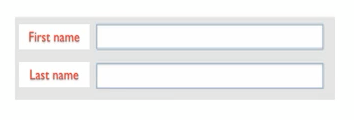
A person with red-green color blindness may not be able to perceive that information. A better solution is to include the actual words “required” next to each required field, or to use bold text or another indicator that helps the text stand out.
Another issue related to color on the Web is the contrast ratio between the background and foreground colors. Insufficient contrast can make it more difficult to read the text on a web page or identify important information in images.
The Web Content Accessibility Guidelines, in version 2.0, require a contrast ratio of 4.5 to 1 for the background and foreground colors. For large text (anything larger than 18 point) the requirement is a contrast ratio of 3 to 1. The only exceptions to these requirements are decorative images that do not serve any kind of interface function (they are not part of the navigation) or text that is included in a logo.
Color simulations are Copyright (c) WebAIM.