Reading on a computer screen is not the same as reading on paper. Reading on a computer screen tends to be slower and more tiring on the eyes, but by paying attention to a few elements of typography you can make it easier to read your content online.
- Making Text Easier to Read: Video Tutorial (CC)
- Video Tutorial: Large Version (.mov, CC)
- Directions (HTML)
- Print Directions (Tagged PDF)
To make text easier to read onscreen, you should consider the following properties of text:
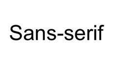
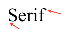
- Font choice: the most common fonts used on the Web are serif and sans-serif fonts. Serif fonts are those, like Times New Roman, which have additional ornaments at the beginning and end of the strokes.
- Sans-serif fonts, such as Arial, do not have these extra ornaments.

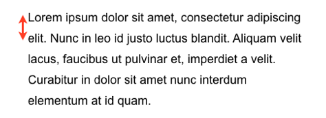
The simplicity of sans-serif makes them easier to read on the screen, especially at smaller text sizes. These fonts are a good choice for the body text in your web documents. - Line-height: the line-height or leading is the space between the lines in a paragraph.

Increasing the line-height can improve legibility by making it easier for readers to distinguish each line in a paragraph.
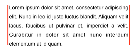
- Alignment: left-aligned text will create a consistent starting point for the eye at the beginning of each line. This is the recommended alignment for long blocks of text. Center and right alignment should only be used with small blocks of text, such as headings. Another kind of alignment to avoid for online text is full justification. When text is fully justified, there are no ragged edges on either side of a block of text. However, in order to create the straight edges, the text in each line has to be stretched out. This can leave behind some unnatural gaps in the text that make reading choppy.

- Case: writing in all caps is considered to be poor etiquette in online communication, because some people consider it the equivalent of screaming. From a legibility standpoint, writing in all caps also makes it difficult to distinguish the individual words in each line of text, and this can have a negative effect on reading speed.
- Contrast: contrast refers to the difference in luminosity (lightness) between the text and the background. To improve legibility, you should make sure the text in your documents stands out sufficiently from the background. The combinations with the best contrast are black text on a white background or white text on a black background.
